
Teenva AI & Digital Ventures builds design systems that go beyond a Figma library — production-ready components in React and Storybook, backed by documented design tokens, so your web and mobile teams ship consistently. Based in Bangalore, India, we work with startups and enterprise teams alike.
As products grow, every team ends up inventing its own version of a button, a form field, or a modal. We unify color, typography, spacing, and components into one system, so your website and Next.js product development move faster with fewer UI inconsistencies and fewer bugs.
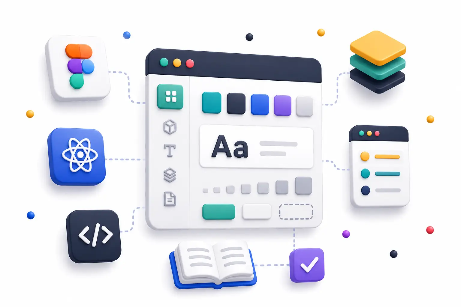
Redesign Your Website
Rebuild on a design system with a consistent UI across your marketing site and product app.
What Is Design System Implementation?
A design system is the shared language between design and engineering. Implementation means we don't stop at drawing components in Figma — we code them, document them, and put a governance process around them so they hold up as your product scales.
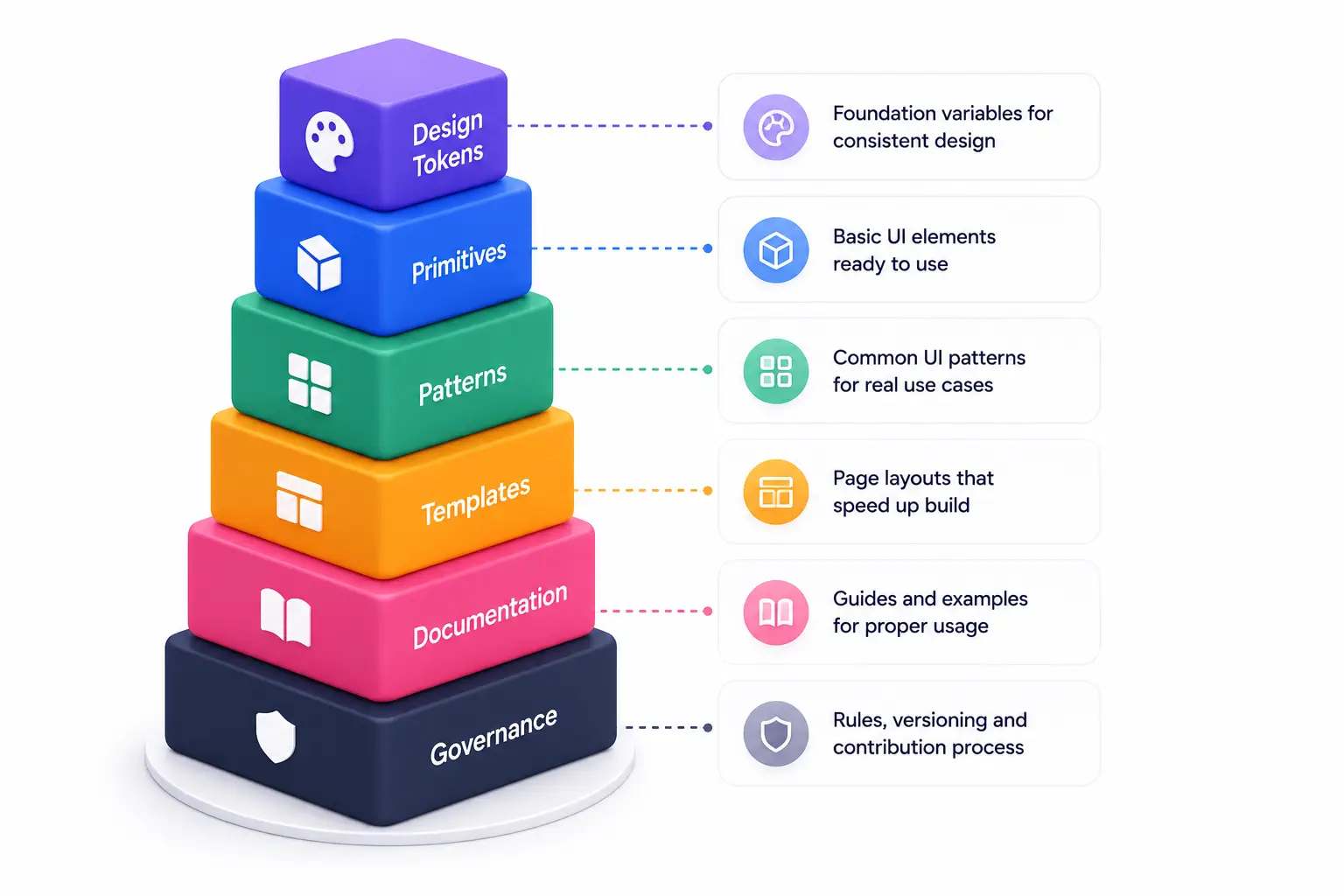
| Layer | Examples |
|---|---|
| Design Tokens | Color, font, spacing, radius, and shadow values as JSON/CSS variables |
| Primitives | Buttons, inputs, checkboxes, badges, icon wrappers |
| Patterns | Form groups, cards, tables, modals, navigation bars |
| Templates | Dashboard shells, marketing section layouts |
| Documentation | Storybook stories, usage guidelines, accessibility notes |
| Governance | Versioning, contribution process, deprecation policy |
What We Build
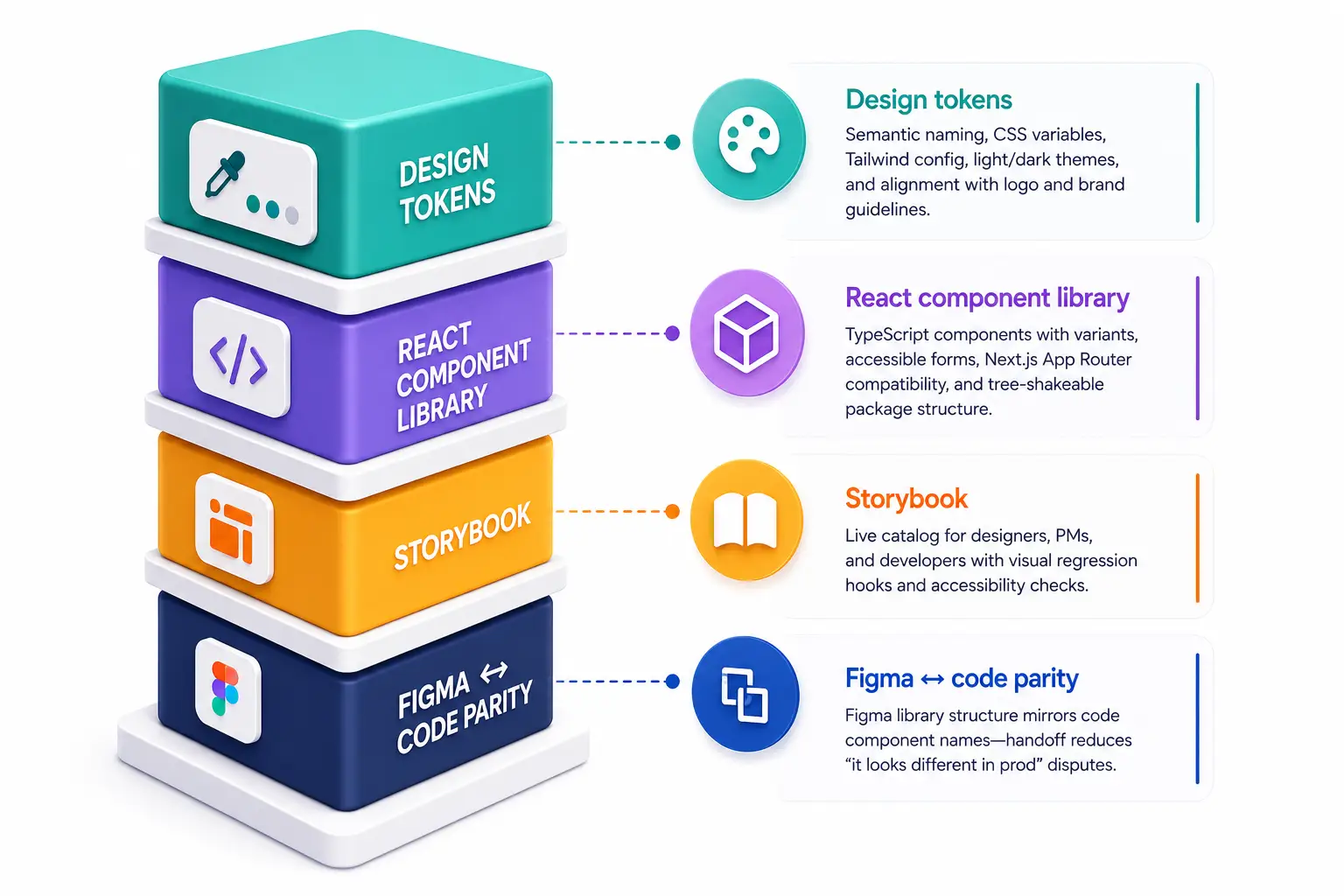
Design Tokens
Semantic naming conventions, CSS variables, Tailwind configuration, and light/dark theme support aligned with your brand guidelines.React Component Library
TypeScript components with variants, accessible form elements, Next.js App Router compatibility, and a tree-shakeable package structure.Storybook
A living catalog for designers, product managers, and developers, with visual regression testing and accessibility checks built in.Figma ↔ Code Parity
Figma library structure mirrors your codebase's component names, so handoff no longer means "it looks different in production."
Compatible with Next.js App Router. Brand alignment through your existing logo and identity. Token export available for mobile app development.
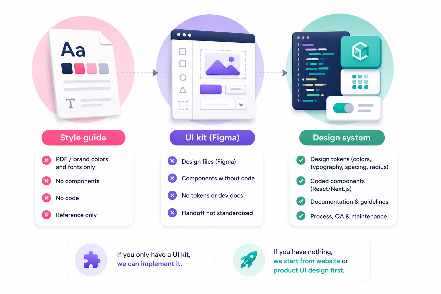
Design System vs. Style Guide vs. UI Kit
| Artifact | What It Is |
|---|---|
| Style Guide | A static PDF covering brand colors and fonts only |
| UI Kit (Figma) | Design files with no corresponding code |
| Design System (this service) | Tokens, coded components, documentation, and process — working together |
If you already have a UI kit, we can implement it in code. If you're starting from scratch, we begin with website or product UI design first.
Why Teenva AI
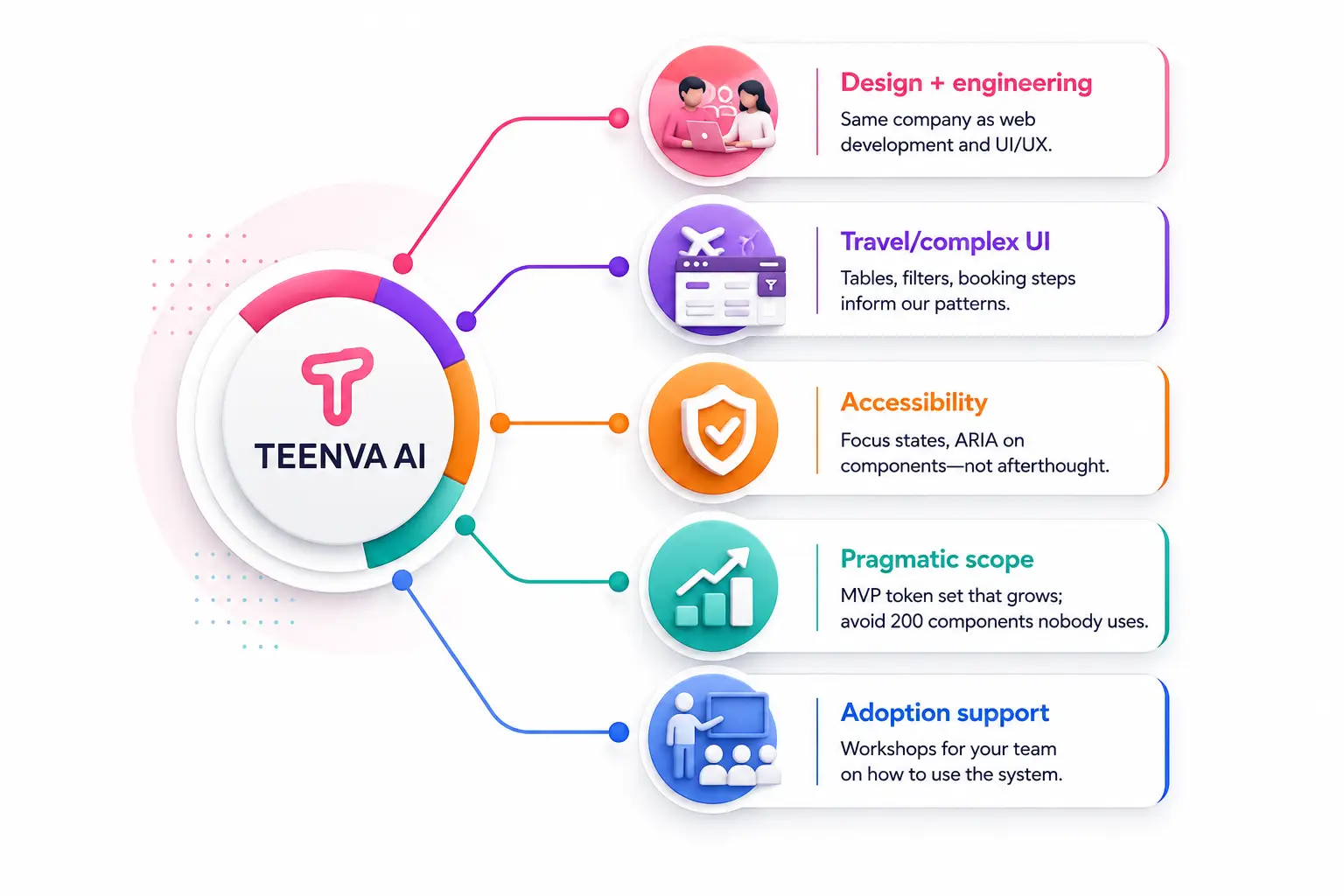
Design + Engineering Under One Roof
The same team that builds your design system also handles your web development and UI/UX design, so nothing gets lost in translation.Experience With Complex UI
Tables, filters, and multi-step booking flows from travel and fintech work inform how we design reusable patterns.Accessibility Built In
Focus states and ARIA attributes are part of every component from day one, not an afterthought.Pragmatic Scope
We start with an MVP token and component set that grows with real usage, rather than 200 components no one ends up using.Adoption Support
We run hands-on workshops with your team so the system actually gets used, not shelved.
Who Needs Design System Implementation?
- Startups post–product-market fit
- Enterprise product squads
- Teams replatforming an existing product
- Travel & fintech companies
- Agencies and portal builders
Agencies white-labeling portals can use theme-level tokens for fast rebranding — see our white-label travel portal work.
Our Implementation Process
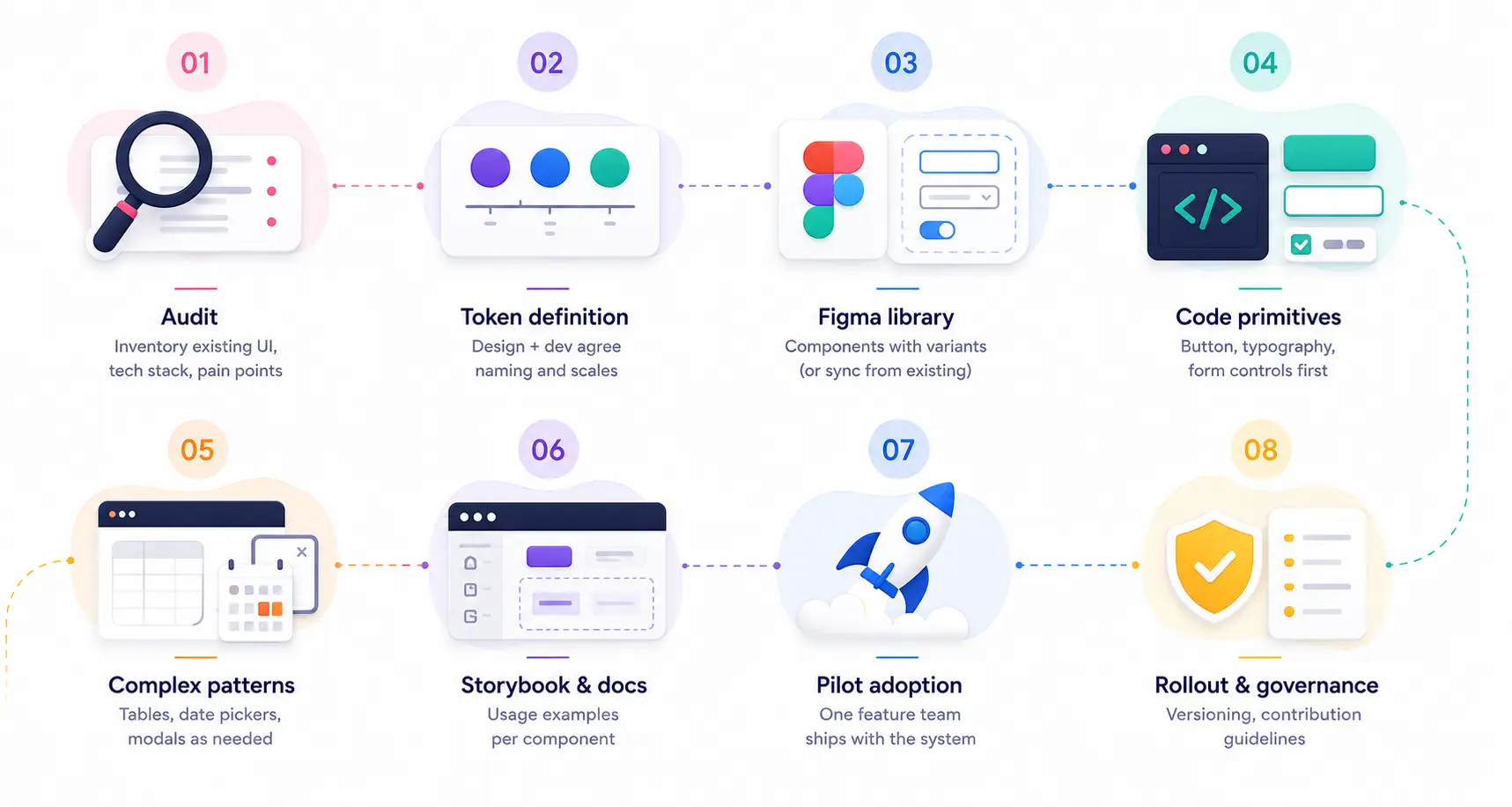
Audit
We inventory your existing UI, tech stack, and pain points.
Token Definition
Design and engineering agree on naming conventions and scales.
Figma Library
We build out components with variants, or sync from your existing library.
Code Primitives
Buttons, typography, and form controls come first.
Complex Patterns
Tables, date pickers, and modals follow as needed.
Storybook & Documentation
Usage examples are written for every component.
Pilot Adoption
One feature team ships using the new system first.
Rollout & Governance
We put versioning and contribution guidelines in place for long-term maintenance.
Tech Stack Options
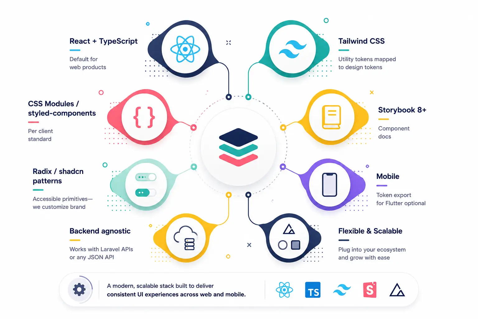
| Stack | Notes |
|---|---|
| React + TypeScript | Our default for web products |
| Tailwind CSS | Utility classes mapped to design tokens |
| CSS Modules / styled-components | Available per client standard |
| Storybook 8+ | Component documentation |
| Radix / shadcn Patterns | Accessible primitives, customized to your brand |
| Mobile | Token export available for Flutter |
Backend-agnostic — works with Laravel APIs or any JSON-based API.
Design System + Motion
We pair design systems with UI animation work, documenting transition tokens (e.g., duration.fast, ease.default) so motion stays consistent across every component.
Maintenance & Evolution
- New component requests handled through a retainer arrangement
- Breaking changes follow semantic versioning for the package
- Figma stays in sync whenever your brand updates
- Managed support available for ongoing package publishes
Frequently
Asked Questions
Straight answers about our services, how we work, and how to get started with Teenva.
Custom software, AI solutions, and travel technology — built for teams that need more than templates.
This is an implementation service — we deliver working code, usually alongside a matching Figma structure.
Timelines depend on the number of components and patterns involved; we scope this during the audit phase and provide a project-specific estimate.
We can work either way — starting from accessible primitives like shadcn/ui and customizing them to your brand, or building fully custom components from scratch.
Yes. We can implement an existing UI kit in code rather than starting design from zero.
Related Services
Build Your Design System
Tokens, primitives, patterns, and documentation — backed by governance so the system stays alive as your product grows.
Ready to take your business to the next level?
Ready to take your business to the next level?